The Wrapper is the Product
This 8 minute read was written by Poncho, published a year ago, and updated a year ago. It is under an MIT License, here is the source.AI is powerful, but without good design, it’s stuck in the "command-line" era, accessible only to specialists. To achieve mass adoption, we need to focus on usability, accessibility, and trustworthiness.
Why AI Adoption Is Stuck
“AI tools go further than ChatGPT or Gemini.” Yeah, no kidding. But for most people, that sentence might as well be lorem ipsum. The deeper issue is that while the tools have evolved, the way we present them hasn’t. They’re wrapped in complexity, built for insiders, and feel like alien artifacts to anyone outside the dev/design/ops trifecta.
You’ve got people using AI every day without realizing it: auto-tagging in photos, autocomplete in Gmail. But as soon as you hand them a “real” AI tool, they bounce. Not because they’re dumb, but because the interface demands they already speak the language. It’s like handing someone a shell script and wondering why they don’t use Linux.
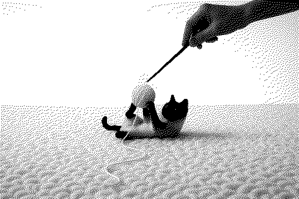
Right now, most AI products are stuck in what amounts to the command-line era of AI. Powerful, yes. But the mental load required to start using them is non-trivial. You need domain knowledge to get value. Which is fine if your users are engineers or researchers. But if your goal is mass adoption?
AI adoption won't come from more powerful models or CEO mandates — it will come from thoughtfully designed interfaces that make intelligence accessible to everyone.
— Nan Yu, “AI adoption is a UX problem”, Apr 2025
And yet companies keep pushing these tools into orgs, chasing productivity boosts. Which works, for a while, because the users are specialists or at least tech-adjacent. But once you hit the edge of that cohort, adoption flatlines. The tools don’t invite exploration. They gatekeep via jargon, unclear feedback loops, and zero contextual affordances. This is where the “AI is a UX problem” take hits hard. We’re not lacking capability. We’re lacking empathy in the interface. Calling tools like Cursor or Perplexity “wrappers” misses the point: they reshape the cognitive cost of interaction. They package raw power into something tractable. Same as how early computers needed punch cards and then boom: GUI. Mouse. Windows. Mass adoption.
The problem isn’t the model. The problem is you have to understand the model to use it. The AI itself might be state-of-the-art, but if the product design treats accessibility as an afterthought, the whole thing collapses outside the tech echo chamber.
So yeah, AI adoption is stuck, not because it’s not ready, but because it’s badly dressed. It walks into the room in an obscure academic paper and expects applause. We need to give it jeans and a t-shirt.
Why It’s Still a Specialist’s Game
It's not that non-specialists can’t use AI tools; technically, anyone can prompt ChatGPT or fire up a model. The problem is that outside a narrow domain, they usually can’t do it well. There’s still an invisible gate around “real” use: domain knowledge. Even simple interactions require users to internalize unfamiliar mental models, vocabularies, and workflows. It’s like asking people to write Bash scripts to check their email. Technically doable. Practically useless.
This is what people mean when they say we’re still in the “command-line” phase of AI. Tools exist. They’re powerful. They’re even public. But the interface? Inscrutable unless you’ve been around the block. The missing layer is usability: thoughtful design that abstracts complexity without neutering power. There’s a canyon between the power users and everyone else, and most products are still shouting across it instead of building a damn bridge.
And look, specialists love this. The market for them is thriving. Enterprise buyers don’t blink at complexity if it means cutting headcount or boosting margins. Whole industries are being refactored around AI-powered productivity. They don’t care if the tool requires a PhD in regex; they’ll train up or hire consultants. These tools were never meant to be “easy,” just effective for people already deep in the weeds.
So what you end up with is a bifurcated ecosystem: hyper-niche products built for the initiated, and mass-market tools that feel like toys because they’re designed with no real user in mind. Meanwhile, the actual design challenge, building interfaces that make powerful tools legible to normal humans, gets sidelined. Not because it’s not important, but because specialists don’t need it, and they’re the ones writing the checks right now.
This is the gap. This is the opportunity. Tools that nail this layer of abstraction, like Cursor, Perplexity, or even GitHub Copilot, are winning not bc their models are better, but because they figured out how to wrap that power in workflows that make sense. We need more of that. Not more AI. More good design.
Product Design is Trust and Accessibility
Trust isn’t some abstract, vibes-based UX virtue. It’s the bedrock of adoption. And in the messy world of AI-driven products, trust has to be earned, not assumed. You earn it in two ways: by being usable and by being consistent.
Start stupid simple. A legit accessibility effort (actual a11y, yes, but also just intuitive workflows and low-friction UX) is one of the most powerful trust levers you have. When users feel seen, like the product understands and anticipates them, they project reliability onto it. This isn’t just hand-wavy psychology; this is baked into how people form trust heuristics with software. Good accessibility is empathy in pixels. And empathy builds loyalty.
But trust also needs resilience. It’s not just “Can I use this?” It’s “Can I count on this?” AI products fail here constantly, partly because they’re non-deterministic, but also because their developers treat uptime and consistency like secondary concerns. It’s not enough to have a model that can work; the whole experience has to predictably work. If I prompt your product the same way twice, will I get the same result? Will I get a result at all? If it fails, will it fail gracefully? Does your interface reassure me that you’ve thought about the edge cases I haven’t?
Even silly stuff like documentation and backlink hygiene feeds into this. Users do notice when your support articles look like a content farm. They notice when half your “blog” is SEO bait. Bad backlinks and sketchy SEO aren’t just marketing sins. They’re trust-destroyers. They make your product look unserious, unreliable, or worse, shady. If Google doesn’t trust you, why should a user?
When you design for accessibility and consistency, trust emerges as a side effect. And that’s what turns an AI tool from a prototype into a product.
A Product is Still a Product: The MVP Trap
There's this recurring fantasy among early-stage AI builders that if you just ship an MVP fast enough, success will sort itself out later. Speed is the religion, and the MVP is its sacrament. But here's the catch: shipping something isn’t the same as shipping something usable. And when you skip usability in favor of feature velocity, you’re not iterating, you’re just tripping over your own feet faster.
Before you write a single line of code, ask yourself: What problem does my product solve?
— Alyona Potapova, SaaS Product Development: Where to Start and Common Mistakes, Apr 2025
An MVP bloated with features but starved of good UX isn’t "lean" or "agile" or whatever other scrum-adjacent term is in vogue right now. It’s a liability. Users bounce not because the AI isn't powerful, but because using it feels like a chore. And once people decide your product is annoying, you're in UX debt hell; it costs 10 times more to fix that first impression than it would have to build it right the first time.
The whole point of an MVP is to get real feedback, but bad usability means bad signal. If people can't even get to the value because the product is janky or confusing, then what are they even reacting to? Not your idea, not your tech, just your bad interface. Congrats, you've successfully validated that no one wants to use your mess.
What’s needed instead is intentional minimalism: solve one real problem, cleanly. Keep complexity down, not by underbuilding, but by making hard decisions early. Choose a tech stack that won’t punch you in the face when you try to scale. Bake in sane design principles from the jump: clarity over cleverness, trust over tricks.
This isn’t about chasing perfection. It’s about respecting the medium. AI or not, a product is still a product. People expect software to feel a certain way: snappy, legible, predictable. Even when it’s doing sorcery under the hood. Especially then.
Conclusion
As we look at the future of AI, it’s clear that success isn’t just about the raw power of models, but how easily users can interact with them. The right design can turn an AI tool from a niche product into something that conveys trust accessible to everyone. To truly reach the masses, AI must learn to speak the language of design, just like any other disruptive technology before it.
References
- Nan Yu, “AI adoption is a UX problem”, Apr 2025
- Alyona Potapova, "SaaS Product Development: Where to Start and Common Mistakes", Apr 2025
- Dr Maria Panagiotidi, "Use of AI In UX: Insights from Recent Research", Mar, 2025
- Goran Paun, "UX Design for AI Products: Merging Innovation with Usability", May, 2024
- The Blue Owls, "UX: The missing ingredient to AI Adoption", January, 2025
- Ken Olewiler, "Designing Our Relationship with AI", April, 2024
- Jakob Nielsen, "Accessibility Has Failed: Try Generative UI = Individualized UX", Feb, 2024
Author Comments
Commented a year ago
I feel like the following thought process is a strange one. There has been tons of "new AI _buzzword_ startups that create the new _buzzword_ tool that _buzzwords_ this and that." and even tons more of "it's just a _something_ wrapper" responses. The problem is that most of these tools speak so little the language of the common user that they never truly enter the masses, even the ones within it's own niche. Who cares if it is a measly "wrapper"? As long as common people get to be able to understand it, worse than this is a non-wrapper product that only a few select group of people get it.